Professor Nathalie Cooke, McGill Library’s Associate Dean of Rare and Special Collections, drew our attention to these cookbooks while giving a seminar to Geoffrey Little’s graduate class in Book History. The McGill Library has a substantial historical Cookbook Collection, steeped in printing curiosities and demonstrating exceptional aspects in book production developments.
For example, Mrs. Beeton’s cookbooks were the most popular British series of cookbooks in the latter half of the nineteenth century. Elizabeth Driver writes that “From its first publication in book form in 1861, Mrs. Beeton’s The Book of Household Management ruled English kitchens for well over half a century.Her monumental text was recognized as a culinary authority throughout the Empire as emigrants carried the complete book, or the various shorter derivations of the original work, with them to their new homes” (Culinary Landmarks, 474).
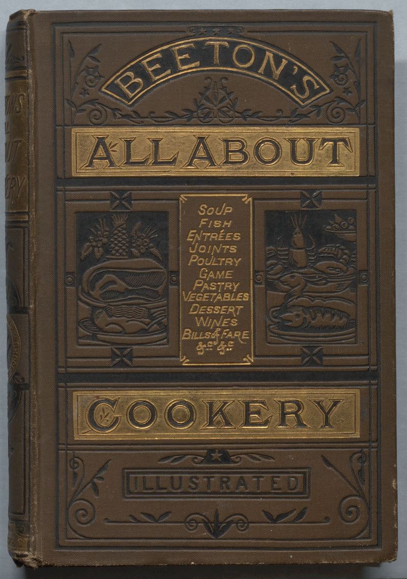
1887. Decorative publisher’s cloth .
They were a staple commodity for the Ward and Lock Publishers in London. Despite the popularity and longevity of the Mrs. Beeton persona, as well as the many editions of ‘her’ books on cookery and household management, the real Isabella Beeton died after childbirth on 6 February 1865.
Ward & Lock used the Beeton name on for a number of affordable every day handbooks such as: gardening, letter writing, dictionaries and household management. We are showing just two of the later British editions, from about 20 titles that Rare Books and Special Collections houses on the “Mrs. Beeton’s cookery” series.
Edition bindings started up in the nineteenth century as the book market expanded and the publishers of books started to do large print runs of popular titles intended for a wide readership. Cookbooks fit the bill, especially the Mrs. Beeton series, which continued well into the twentieth century. In the 1830s, for various reasons, publishers started to assume the responsibility for binding their own editions. Cloth was their choice material – it was more durable than paper; and less expensive than leather.
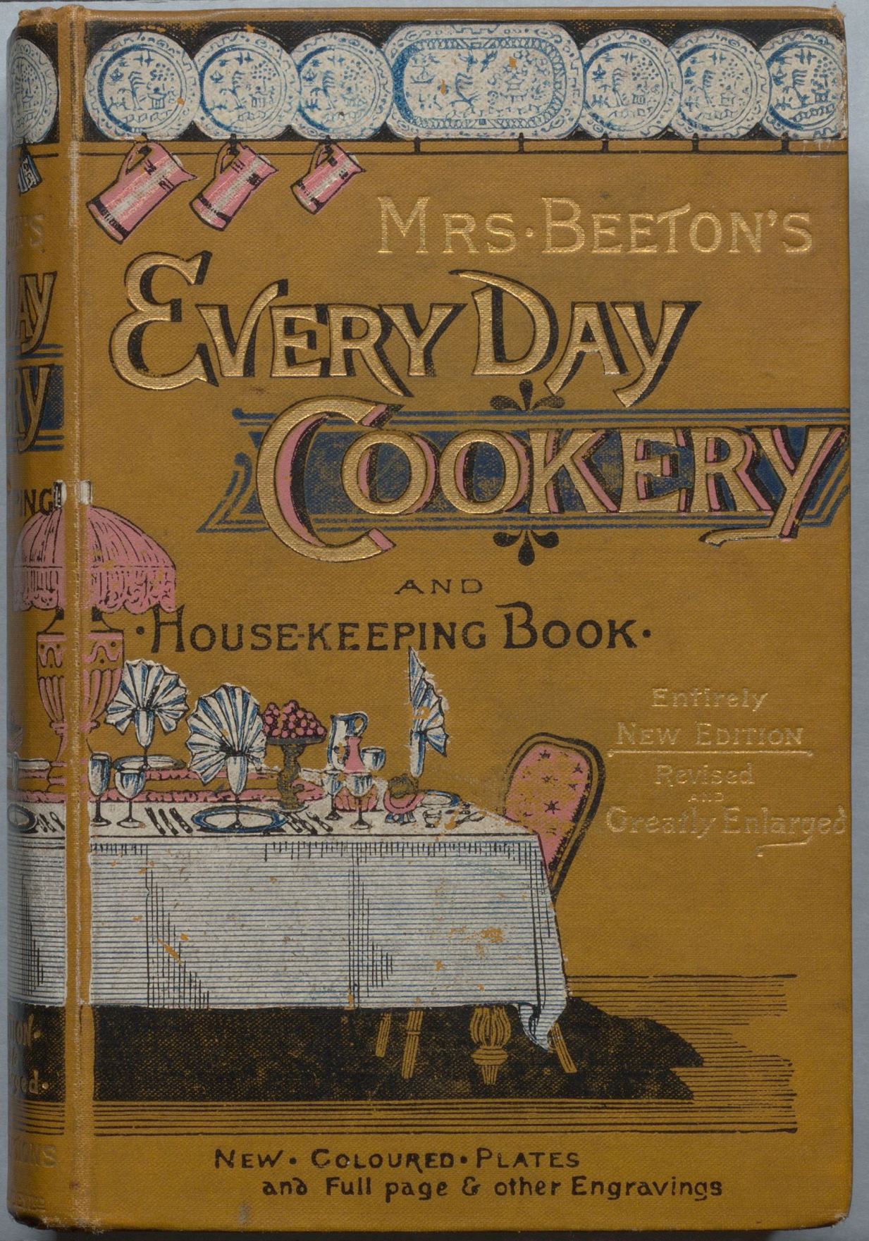
1893. Pictorial publisher’s cloth.
Publishers commonly had their names stamped at the bottom of the spines, hence the book collector’s term: “in publisher’s cloth”. Publishers understood that illustrated covers “could be used to enhance the outward appearance of a book and thus help catch the eye of the buyer” to encourage a sale (Percy Muir, Victorian Illustrated Books, 1971). At first, cloth bindings were dyed in colours and either textured or decorated in simple border designs by a blind-stamping process, and used small squares of paper as spine labels. By the 1840s, lettering and decorative and pictorial designs, were filled in with black or gilt, and applied directly onto the cloth.
Elaborate, multi-coloured pictorial cloth bindings picked up where stamped bindings left off. The Ward and Lock edition from 1893, is an excellent example of this trend, which was at the height of popularity in the late Victorian era. It is bound in a smooth cloth dyed mustard yellow; the front cover and spines are partly stamped and partly printed in colours: white, black and pink and a bit of blue. The design is carried over to the spine.
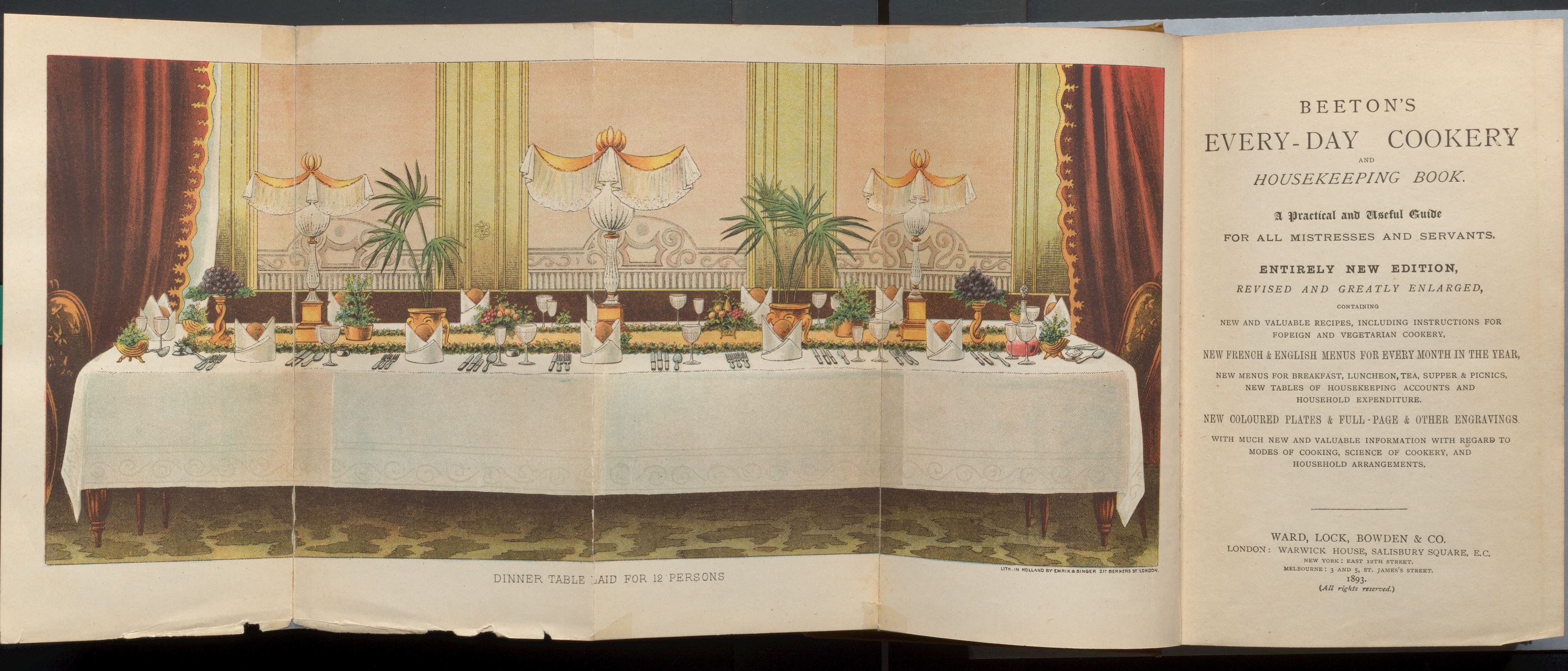
Folding frontispiece in Mrs. Beeton’s Every Day Cookery, London: Ward & Lock, 1893. Chromolithograph made in Holland by Emrik and Binger.
At this time, cover art might take its inspiration from the illustrations in the text or from the inserted plates of illustrations. The covers of the 1893 edition obviously borrows from the quite remarkable folding frontispiece.
Pictorial publisher’s cloth bindings are in many ways precursors to the dust jacket as an advertising medium, the kinds that are still in use today for cloth-bound, hard covered books.