Nicholas Cronk on Voltaire at McGill

AN AMERICAN VOLTAIRE: The J. Patrick Lee Voltaire Collection at McGill

By: Nicholas Cronk, Voltaire Foundation, Oxford University

Published by Cambridge Scholars in 2009, with contributions by Nicholas Cronk and other Voltaire scholars.

Pat Lee, who died in 2006, was a life-enhancing friend as well as a Voltaire enthusiast and an avid collector of books. The J. Patrick Lee Voltaire Collection was acquired by McGill in 2013, and contains some 2000 books and 42 manuscripts, relative to Voltaire and his contemporaries. I recently had the huge pleasure of helping Ann Marie Holland organise in the Rare Books Library a small exhibit containing just a few of the highlights of this collection.

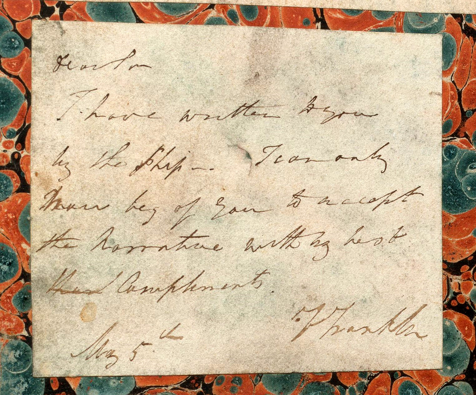
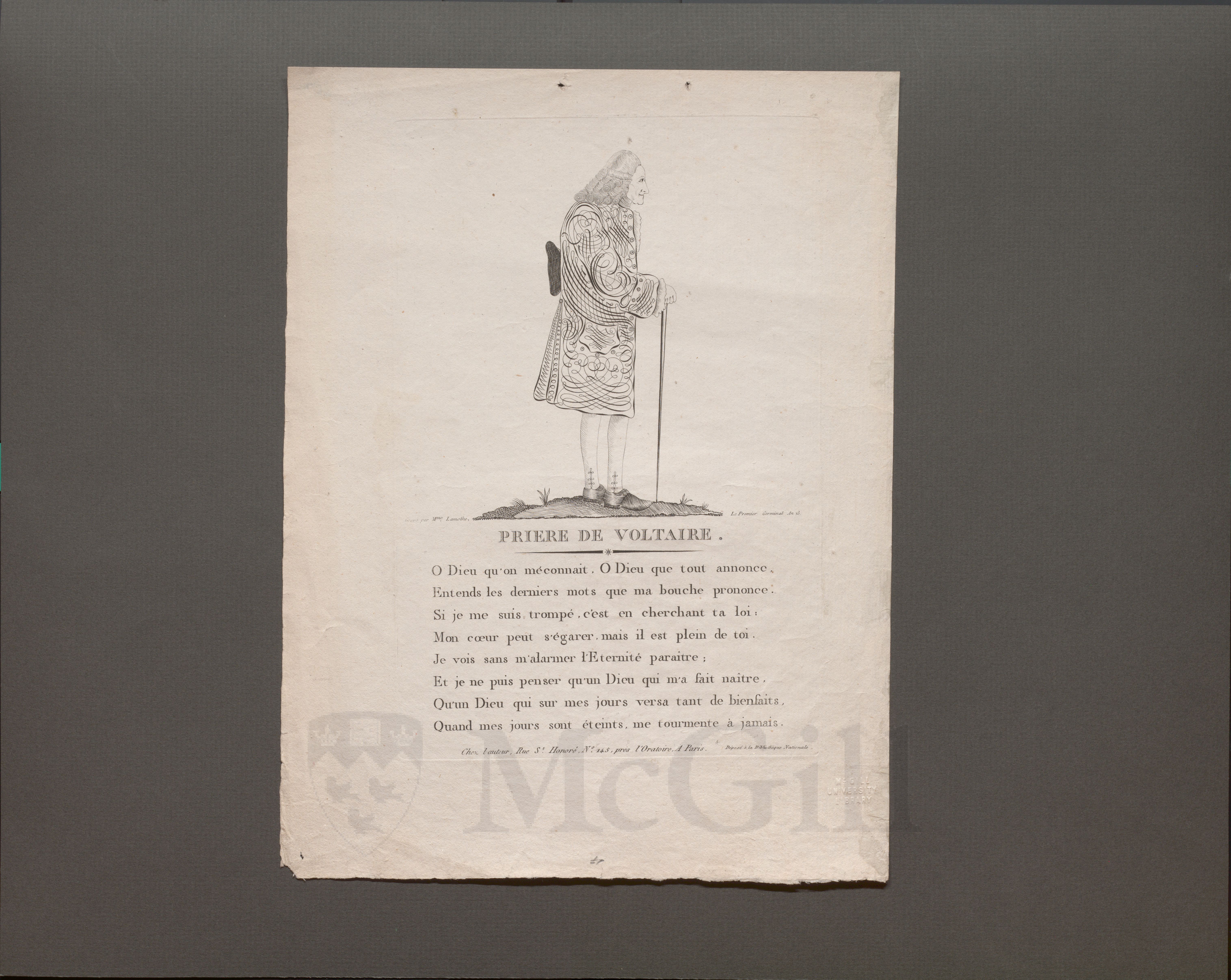
Like any great collection, this one has its share of precious printed books, as well as some remarkable manuscripts, not least  a manuscript compilation of verse that belonged to Voltaire’s companion, Emilie Du Châtelet – this last item has been exhibited in Paris at the Bibliothèque nationale de France. The compilation also has its unique personality: Pat Lee, as an American- who loved Voltaire, was born in Kentucky, and wrote his doctorate on Voltaire at Fordham University in New York – clearly had a particular predilection for books by and about Voltaire that were in some way connected with America.

Americans were keen readers of Voltaire from the early years of the Republic, and the provenance of some of the items is startling: a volume of Voltaire that belonged to Theodore Roosevelt, and a manuscript collection of French poetry with the bookplate of … George Washington. But it’s not just the famous names that are interesting. A book called Fame and Fancy, or Voltaire Improved, published in Boston in 1826, provides an American take on Voltaire: but Pat Lee’s copy is also interesting because the bookplate records its American owner: ‘Daniel Green, Jr., Portland, Maine’.

Another remarkable production from the same decade is Abner Kneeland’s translation of Voltaire’s Dictionnaire philosophique, also published in Boston in 1836. 
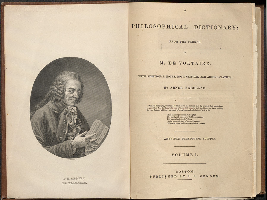
Kneeland (1774-1844) was an evangelist minister of radical views, remembered as the last man jailed in the United States for blasphemy – among his publications are The Deist (1822) and A Review of the Evidences of Christianity (1829).  His edition of Voltaire’s Philosophical Dictionary was clearly a polemical gesture therefore, and one of the copies in Pat Lee’s collection is exceptional. The anonymous American owner has inserted two blank sheets in the middle of the volume, with pages headed ‘Births’, ‘Marriages’ and ‘Deaths’. It was common of course for families to own a ‘family Bible’ with such blank pages serving to record key events in a family’s history, a volume that would be handed down from generation to generation. In this (unique?) example, a nineteenth-century American has radically subverted the genre of the ‘family Bible’ by creating a ‘family Voltaire’. Only in America…

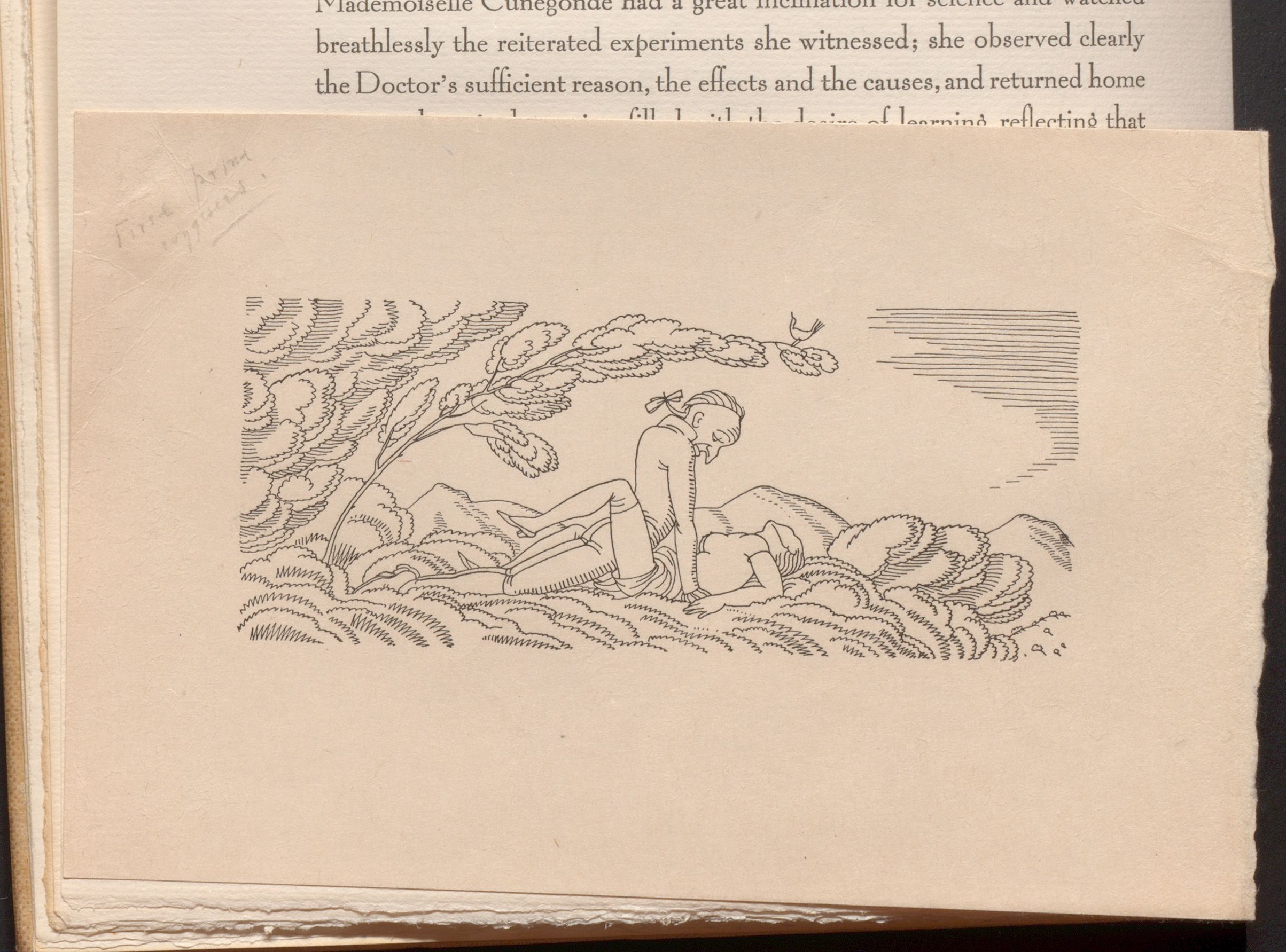
A tipped in censored illustration of Rockwell Kent’s Candide intended for the 1928 edition.

In the twentieth century, New York publishers were active in producing illustrated editions, and there are some remarkable illustrated Candide in this collection. The Rockwell Kent illustrations for Random House (1928) are justly famous – not least because the picture of Voltaire’s house in the colophon went on to become widely familiar as the Random House logo. Rockwell Kent’s first depiction of Pangloss conducting an experiment in natural philosophy in the shrubbery was deemed too shocking, and he had to replace it with a more anodine image:- the first edition in this collection is very special because it includes a real rarity -the ‘censored’ image has been tipped in to cover up its timid replacement.( See also the NYPL Candide website for more on Rockwell Kent)

The Rockwell Kent Candide is a celebrated publication, but also remarkable is the fact that the year before, 1927, there had appeared an edition of Candide illustrated by Clara Tice, a bohemian figure known as the Queen of Greenwich Village (below left); and two years later, in 1930, there was an illustrated edition by Mahlon Blane (below right).

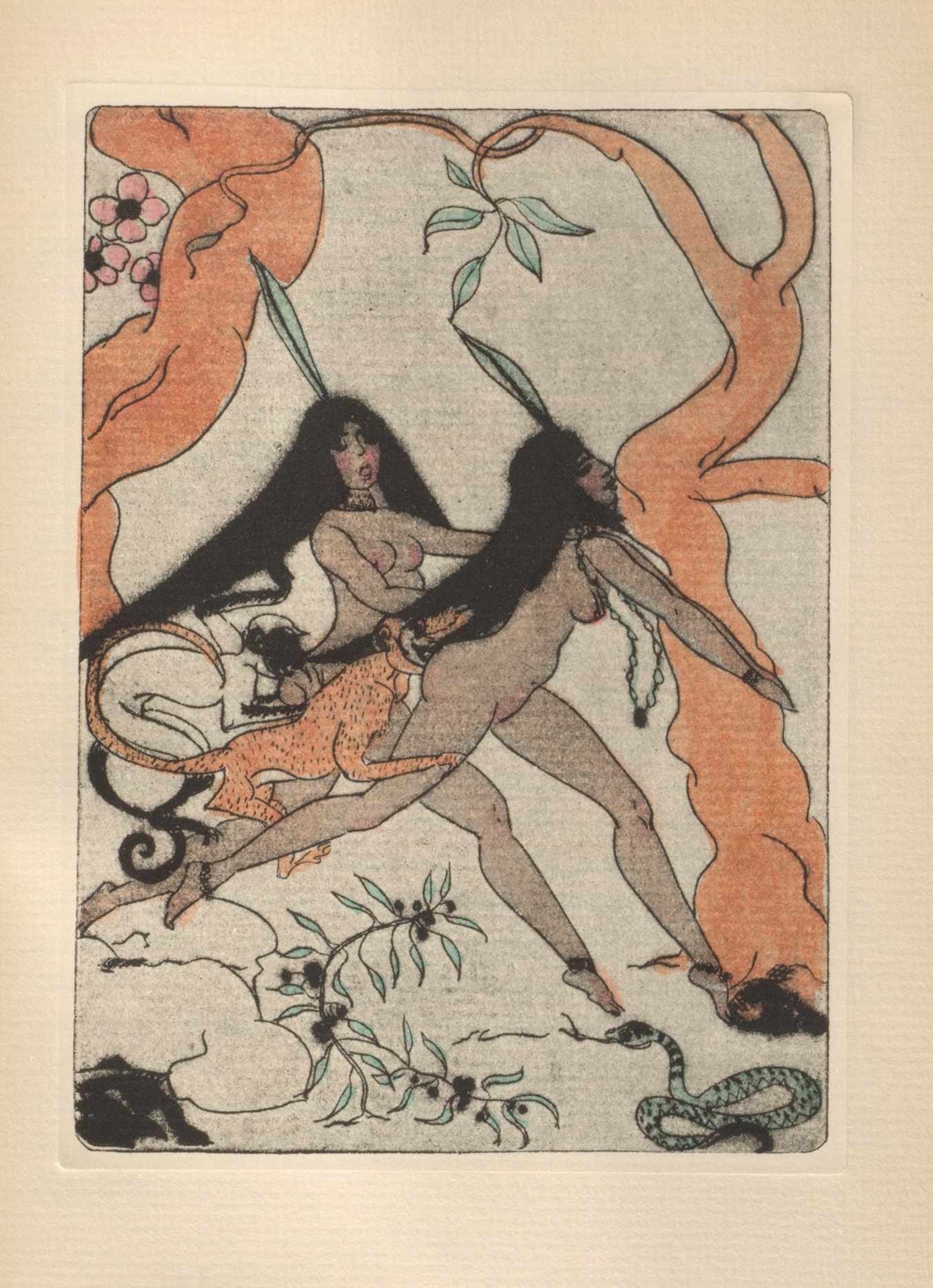
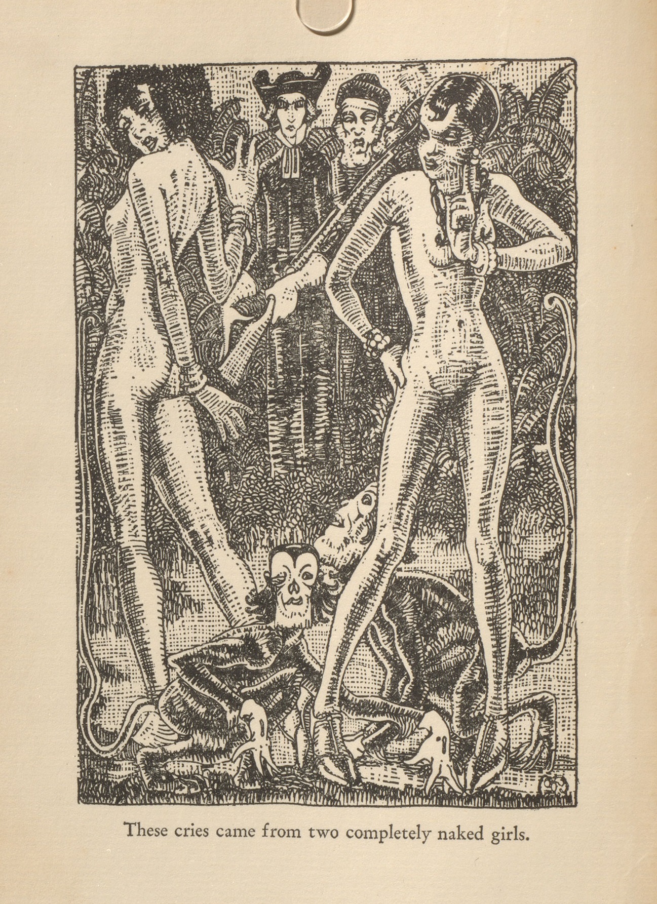
This is real testimony to the vibrancy of the American market for illustrated books: three major illustrated editions of Candide all published in New York within the space of four years – and all three in completely contrasting artistic styles.

Continue reading

Franklin Restored

 A Signed Presentation Copy by John Franklin to Wentzel

McGill Rare Books houses several hundred historical books related to polar expeditions from the late eighteenth and nineteenth centuries. These books document the tremendous struggles in navigating icy seas and obtaining adequate provisions for their wintering stations. Crews of men  were hoping for a break though in claiming a northwest passage for Britain from the Atlanic Ocean to Asia.

The expeditions of Sir John Franklin are particularly in the public eye due to  the recent investment in search expeditions funded by the Canadian government which led to the discovery of the two ships used for Franklin’s third fateful expedition to the Arctic in 1845 (HMS Erebus was found in 2014, and the wreck of HMS Terror in 2016). The ships disappeared after they became locked in ice in 1846. What of the earlier successful missions? Many of the copies of the first and second Franklin voyages were just recently restored with a generous gift of funds from the Lang family. This includes an extraordinary copy of Franklin’s first Narrative of a Journey to the Shores of the Polar Sea, in the years 1819, 20, 21, and 22, published in London by John Murray in 1823.

McGill’s copy is  extraordinary through its provenance to Captain Franklin (1786-1847). It is a SIGNED PRESENTATION COPY from John Franklin to W. F. (Willard Ferdinand)  Wentzel, a fur trader who had aided Franklin by hiring guides and hunters for the expedition when they were at Great Slave Lake in July of 1820. A part of Franklin’s inscription reads as follows: “Dear Sir, I have written to you …. I can only now beg of you to accept the Narrative with my best compliments. May 5th [1823], [signed] J. Franklin.” 

This inscription is a chilling reminder of the teams of men who attended to affairs at remote trading posts and their crucial service to expeditionary missions. At the same time, it is wonderful to be in such close proximity to the story of Franklin and Wentzel through an historical artefact. The volume was passed along through relations of Wentzel all the way to McGill Library sometime around 1890. It even appears to have weathered through some tough conditions itself – making it a priority pick for restoration.

Beyond being a detailed  journal of events, Franklin’s first edition  also offers numerous charts, diagrams and  illustrations, some  of which are hand-coloured. Most of the plates are engraved by Edward Finden from the original drawings of Lieutenants Robert Hood and George Back.They convey the challenges of a majestic natural environment, before an era of melting ice caps.  The  engraving below shows an encampment set up in winter time 1820, nearly two hundred years ago, during a land expedition. Despite hardships this view suggests a perfectly habitable landscape, even an inviting one, on the periphery of the true northern arctic. We hope to leave you with a feeling of wonder from this Winter’s Night Scene.

“Resting Place on a Winter’s Night”. Drawn by Lieut. Back and engraved by Finden in Franklin’s first Narrative to the Polar Seas (London: 1823).

Special Announcements

The Robert R. Reid multi-site exhibition curated by  CAUSA in association with McGill University Library (Rare Books and Special Collections) has been extended so as to complement the 61st annual conference of the non-profit ASSOCIATION TYPOGRAPHIQUE INTERNATIONALE, which is hosting ATypI Montréal 2017″  from September 12th  to 16th,  2017.

On September 15th, 2017, a special tour of the Robert R. Reid Exhibition and Touch Table Display will be made available to members of the ATypI conference.

Click here for the special events calendar.

Digital Typography and Design by Robert R. Reid


….And join us when American scholar Paul Shaw will speak from 7 to 8 pm, September 15th 2017 on W. A. Dwiggins.

Paul Shaw, who has spent nearly 40 years researching the life and work of American typographer and book designer W.A. Dwiggins (1880-1956) will discuss some of the material by and about Dwiggins housed in the William Colgate History of Printing Collection, located in Rare Books and Special Collections of the McGill University Library,4th floor of the McLennan Library Building.

We look forward to receiving members of ATypI to our library.

PRESENTING REID’S DIGITAL DESIGNS

“ROBERT  R. REID: RE-READING (CLOSELY)”

By Special Guest Writer :  David Bellman, Research Curator,
CAUSA / Collective for Advanced and Unified Studies in the Visual Arts


Designed by Robert R. Reid

■ A point of contact and an action point activated: verbal-visual presence/revivification of text (and tempo) through listening and looking (localization in a nexus of previously unrelated pattern and proposition).

A resulting field of force: TYPOGRAPHICAL TELETRANSPORTATION.

________________________________________

The term “typographical image” has been adopted as a descriptor for identifying the densely self-contained digital-experimental designs that Robert R. Reid has produced in close collaboration with CAUSA –for purposeful use within variable curatorial research projects (including the current, ground-breaking exhibition at McGill  Library). And that carefully conceived nomenclature links, concisely/expansively, to this lucid epigram by the Taoist philosopher Chuang Tzu:

People cannot see themselves in running water. They see
themselves in still water, for only stillness can see stillness.

To further clarify a long-term, self-sustaining function for Reid’s rigorously committed USE OF THE AESTHETIC, an observation by Carl Sandburg can be constructively evoked. He connects us to Reid’s capacious creativity with a specific insight:

The inexplicable is all around us. So is the incomprehensible.
So is the unintelligible.

Sandburg’s insights date from 1950 –one year after the publication of Reid’s  first book (produced by him as founder of Canada’s first artisanal private press).

Continue reading

Robert Reid’s Postage Stamps

reidstampwoodcarvingcroppedtwiceIn March of this year, Robert Reid wrote a blog article for the Alcuin Society which began like the beginning of a suspense novel: “I was running a type house in Montreal at the time I was asked to design Christmas stamps.”

This would have been at the time of Expo 67. It is a nice story to recount, just as Peter F. McNally once did  for the Reidfest held in 2007. The story goes that Robert Reid created some designs as proposals for holiday stamps, which he had printed up on perforated sheets and mailed in to an art committee working for the Post Office. In the meantime, one of his employees had swiped a stamp out of the wastebasket and used it. Reid did not take the prize, and within two  weeks, the mounted police were knocking at his door on Sherbrooke Street, and up the street at McGill’s Rare Books Department, where Mrs. Elizabeth Lewis, the Head of the Department, had been steadfastly archiving all of  Robert Reid’s printed productions, whether large or small. She had to hand over her batch of stamps as well. The original story can be found here.

Fortunately, a hidden stash of the proof stamps is still within our grasp here at McGill University, in the William Colgate Collection, specialized in the History of Printing. Reid points out that the design below was based on a native French-Canadian wood sculpture dating back to the 18th century, a carving that he had come across at a  Museum in Quebec City.

Robert R. Reid is an award-winning typographer, graphic designer and letterpress printer- an acknowledged leader of the private press tradition in Canada. The William Colgate Collection showcases the fine printing he achieved during the “Montreal years”. His life reads like a good novel.

reidstampwoodcarvingcropped

Born in 1927, Reid came to Montreal in 1963 from British Columbia. He spent more than ten years in Montreal from1963 to 1976. He first held the position as Designer and Production Manager for the McGill University Press, a responsibility he held for five or more years. During that time, he also accomplished really exquisite limited and special editions. The Lande Bibliography (1965) and the Notman Photo Album entitled: Portrait of a Period (1967) are two of the outstanding productions achieved under his direction in that category.

Reid later became Director for a new Publications Service at McGill University, serving the needs of multiple departments for various kinds of “job printing” – event posters, announcements, booklets, invitations, and various printed projects of an ephemeral nature, such as these colourful postage stamps. Reid moved on to New York by 1976, and stayed there for some twenty years. He is now back in British Columbia.

For a taste of the incredible and comprehensive record of Reid’s career, we invite you to consult his memoirs which are held in the William Colgate Collection entitled: Printing a Lifelong Addiction (Vancouver: 2002-2007) in 5 volumes and 13 parts, at last count. McGill has  No. 3 of just 16 copies of the volume on the “Montreal” years. It is a good place to start in order to appreciate the excellence of Robert Reid’s talents in the art of printing, and book-making. And of course, we have the originals.

We wish you very happy holidays.

**********************************************************************************************

And in connection with stamps, ..coming soon is a wonderful exhibition to be held at the McLennan Library entitled:  “Every Stamp a Story: History, Culture and Art through the Lens of Philately”, curated by David M. Lank, and sponsored by the Friends of the Library. On view as of January 13th, 2017.

Now it just so happens that David M. Lank and Robert R. Reid published a very handsome book together on Thomas Bewick. To be continued… .


Rare Books Take on an Added Dimension

La version française suit

By Ann Marie Holland

As technology continually reshapes the world, modern academic libraries are finding innovative new digital projects and presentations to breathe renewed life into rare treasures from centuries past. Moving from the physical to the digital is allowing McGill students, faculty and researchers to explore ROAAr‘s rich holdings in creative new ways.

videowallatmontrealhistorygrouppaulkane

Visualization wall in the Research Commons

Last year, the McGill Library launched its new Research Commons, an innovative, collaborative space that provides next-generation tools to students and researchers. The Commons includes a high-tech visualization studio capable of projecting high-resolution images onto a large video wall comprised of eight video screens.

ianmaclarenatmontrealbookhistorygroup

Emeritus Professor Ian MacLaren  presenting “From ‘nothing but a pasenger [sic]’ to Canadian Hero: Paul Kane’s Authorship of Wanderings of an Artist (1859).”

This October, ROAAr put that new technology to the test during a public lecture by Emeritus Professor Ian MacLaren (University of Alberta) about prominent 19th-century Canadian artist Paul Kane (1810-1871). Kane travelled from Ontario to the northwest quadrant of North America in the 1840s, sketching and painting the life and customs of the indigenous peoples across the vast northwestern Canadian wilderness. This initiative would eventually grow into a key documentary and visual history of the west, a portion of which was published in London in 1859 as Wanderings of an Artist among the Indians of North America : from Canada to Vancouver’s Island and Oregon through the Hudson’s Bay Company’s Territory and Back Again. Continue reading

Mrs. Beeton in Publisher’s Cloth

Professor Nathalie Cooke, McGill Library’s Associate Dean of Rare and Special Collections, drew our attention to these cookbooks while giving a seminar to Geoffrey Little’s graduate class in Book History. The McGill Library has a substantial historical Cookbook Collection, steeped in printing curiosities and demonstrating exceptional aspects in book production developments.

     For example, Mrs. Beeton’s cookbooks were the most popular British series of cookbooks in the latter half of the nineteenth century.  Elizabeth Driver writes that “From its first publication in book form in 1861, Mrs. Beeton’s The Book of Household Management ruled English kitchens for well over half a century.Her monumental text was recognized as a culinary authority throughout the Empire as emigrants carried the complete book, or the various shorter derivations of the original work, with them to their new homes” (Culinary Landmarks, 474).

1887. Decorative publisher’s cloth .

They were a staple commodity for the Ward and Lock Publishers in London. Despite the popularity and longevity of the Mrs. Beeton persona, as well as the many editions of ‘her’ books on cookery and household management, the real Isabella Beeton died after childbirth on 6 February 1865.

Ward & Lock used the Beeton name on for a number of affordable every day handbooks such as: gardening, letter writing, dictionaries and household management. We are showing just two of the later British editions, from about 20 titles that Rare Books and Special Collections houses on the “Mrs. Beeton’s cookery” series.

Edition bindings started up in the nineteenth century as the book market expanded and the publishers of books started to do large print runs of popular titles intended for a wide readership.   Cookbooks fit the bill, especially the Mrs. Beeton series, which continued well into the twentieth century. In the 1830s, for various reasons, publishers started to assume the responsibility for binding their own editions. Cloth was their choice material – it was more durable than paper; and less expensive than leather.

1893. Pictorial publisher’s cloth.

Publishers commonly had their names stamped at the bottom of the spines, hence the book collector’s term:  “in publisher’s cloth”. Publishers understood that illustrated covers “could be used to enhance the outward appearance of a book and thus help catch the eye of the buyer” to encourage a sale (Percy Muir, Victorian Illustrated Books, 1971). At first, cloth bindings were dyed in colours and either textured or decorated in simple border designs by a blind-stamping process, and used small squares of paper as spine labels. By the 1840s, lettering and decorative and pictorial designs, were filled in with black or gilt, and applied directly onto the cloth.

Elaborate, multi-coloured pictorial cloth bindings picked up where stamped bindings left off.  The Ward and Lock edition from 1893, is an excellent example of this trend, which was at the height of popularity in the late Victorian era. It is bound in a smooth cloth dyed mustard yellow; the front cover and spines are partly stamped and partly printed in colours: white, black and pink and a bit of blue. The design is carried over to the spine. Continue reading

Announcement: Lecture by Professor I.S. MacLaren on Paul Kane

We welcome you to a lecture at McGill Library’s  Research Commons Presentation Space_A for a compelling lecture on Paul Kane’s Wanderings of an Artist (1859), to be delivered by Emeritus Professor Ian MacLaren (University of Alberta).

MacLaren posterBloglarge


Professor MacLaren will discuss Paul Kane (1810-1871), the best known artist of early English-language Canada, and the alteration of his field writings to make a book “readied for the press” under the title:Wanderings of an Artist among the Indians of North America : from Canada to Vancouver’s Island and Oregon through the Hudson’s Bay Company’s Territory and Back Again.

This book appeared in London in 1859 by the publishing giant Longman, and would transform Kane into a hero of early Canada. It was followed by  subsequent editions, such as a French translation produced in Paris in 1861; and a closer-to-home version out of Toronto in 1925 by the Radisson Society of Canada.

This event is free of charge and all are welcome. Please note the room location at the Research Commons Room A. This event is sponsored by the Montreal Book History Group, and the McGill Library’s new ROAAr (Rare and Special Collections, Osler, Art and Archives) division.

Voltaire by Madame Lamothe

voltaire-exhibitionTo supplement the exhibit on Voltaire, we have conducted further research on the exhibit’s centre piece. It is a handsome standing portrait of Voltaire represented in the later years of his life, with calligraphic flourishes on his jacket, hat under one arm, and a cane in the other, entitled “PRIERE DE VOLTAIRE”. Printed in Paris in 1805, this engraved portrait turns out to be quite rare.

Exhibitions are a matter of team work. First of all, our sincere thanks to Michael David Miller, Liaison Librarian for French Language and Literature from McGill’s Humanities and Social Sciences Library, who helped to prepare and mount the “Celebrating Voltaire” exhibition. As for the image, thanks to Greg Houston of Digitization Initiatives, for digitizing several Voltaire-related imprints; and to Lauren Goldman, Communications Officer from the McGill Library, who integrated this image into various announcements relative to our series “Celebrating Voltaire”. Selection for the exhibition was accomplished in collaboration with the Head of Rare Books and Special Collections, Dr. Richard Virr, who identified and designated this print as the “brand” image for the McGill Voltaire Collection. This flurry of activity of course was inspired by the recent extraordinary acquisition in 2013 of the J. Patrick Lee Voltaire Collection. In the case of this print, we are making connections from the established collections to the topic of Voltaire.

It is uncommon to see an engraving signed by a woman in the early 19th century. Unfortunately we do not know more about Madame Lamothe for the time being.

Secondly, McGill’s use of the print as advertisement has not always made obvious the text printed beneath the portrait: a “Prayer ”engraved in roman lettering, consisting of 8 lines of poetry, in 4 rhyming couplets. In fact, the text can be traced to an earlier print (de Vinck 4102), probably from the 18th century.

The plate is signed on the left side of the portrait as: “Gravé par Madame Lamothe”; and dated on the right side as: “Le premier Germinal An 13” (ie. March 22, 1805). At the bottom centre of the plate, is inscribed the place of printing and publication: “Chez l’Auteur, rue St. Honoré, N°145, pres [sic] l’Oratoir, A Paris. – Déposé à la Bibliothèque Nationale. This print of Voltaire is indeed held at the Bibliothèque nationale de France, but for the moment no other locations can be found, including other institutions in North America. Continue reading