CmapTools in the Cloud (yay!)

Have I been waiting for this to happen…I’ve been using the freely available desktop version of CmapTools for years, extolling the virtues of this classic concept mapping tool, and now the good folks at the Florida Institute of Human & Machine Cognition (IHMC) have unveiled Cmap Cloud.

Concept maps are graphical representations of knowledge – think brainstorming or mind mapping but a little more structured. They usually start with a focus question and run hierarchically, demonstrating the relationships between concepts. One of the great things about CmapTools is that when you connect two concepts together you are prompted to add a linking phrase to define the relationship. Rather than just typing [pie]–[cherry], you might specify [pie]-can be-[cherry]. It turns out that this is not the easiest thing to do. We can write reams of text on a topic but at the same time get rather stuck mapping it out. In this way, concept maps demonstrate our knowledge of a subject area and reveal misconceptions. When we add new information to maps, we build connections to what we already know and meaningful learning can occur. Concept maps can also be used in groups to reach a shared understanding of the tasks at hand, with the added bonus that concepts in CmapTools can have resources attached to them. If you haven’t yet taken the time to explore the software, I invite you to try today and get in touch with me if you have questions.

Back to the Cloud. The desktop version allows you to save concept maps on a public server and create a website for sharing – amazing – but with the advent of the Cmap Cloud, you can also save your maps there and edit them online. I have been using it for a couple of days now and it can be a little slow at times, but many of the features are there. The nice part is that you can make friends with other Cmappers and share folders to work on projects together.

IHMC also have a new CmapTools for iPad. It is free to download but there is an in-app purchase to be able to export maps and sync them with the Cmap Cloud. I’ll be spending some time with it so look for my review on our new mobile apps blog.

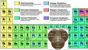
Periodic Table of Visualization Methods

Periodic Table of Visualization MethodsI am a big promoter of using concept mapping to access the implicit knowledge that is trapped in our brains. Concept maps are graphic representations of knowledge that facilitate the organization of information, whether it is for a project we are planning or for research we are engaged in. I use the CmapTools software since it also allows me to save concept maps on a server and share them online.

It is, however, not the only technique for concept visualization, which is why I have often turned to the Periodic Table of Visualization Methods for inspiration. The table also includes methods for visualizing quantitative data (pie charts, line graphs, etc.) mapped to the alkali metals, methods for information visualization that transform data into images (data maps, flow charts, etc.), strategy visualization used commonly in management (such as stakeholder maps), metaphor visualization to convey insights about information (metro maps, bridges, etc.), and, lastly, compound visualization methods that bring together multiple graphical representation formats. Each element box also has additional information, such as the mode of thinking.

If you have any trouble scrolling over the element boxes and would like to see each of the methods separately, Chris Wallace has implemented an XML page that allows you to hide or view each image and also links out to Google images and Wikipedia entries.

Next week I will be attending the Visual Thinking with Mind-Mapping and Creative Modeling workshop at the School of Continuing Studies. I will be sure to post on what I learn there and share any new resources I come across. If you have any to share please do so in the comments box.

Have fun expressing yourself with these visualization methods!

Women as academic authors over the years, 1665-2010

Infographics are visually appealing and effective ways of representing statistics, knowledge, and data, both qualitative and quantitative. Some are static and others are interactive, like this infographic showing the percentage of academic papers published by women over the last five centuries.You can interact with the infographic by selecting which time period you would like to see represented and you can also sort the information in a few different ways. Be sure to read more about the data and how it was gathered, examined, and ultimately represented. This infographic comes from The Chronicle of Higher Education and the data was drawn from JSTOR, a digital archive of scholarly papers, by researchers at the University of Washington.

Image courtesy of www.bestcollegesonline.com

Watch the growth of Walmart and Sam’s Club, 1962-2010

Sometimes you just have to “see” the numbers to believe them. Walmart has to be one of the most ubiquitous big-box stores in North America. When it comes to how many retail outlets there are, there’s really no number that would surprise me. But if you translate that statistic into a cool data visualization map, I’m blown away. Check out this video from FlowingData where you can watch Walmart “spread like wild fire” across the US.

Image from www.neoformix.com